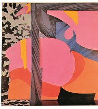
As Fred Perry pays homage to legendary graphic artist Barney Bubbles in its new A/W collection, we remember five of his most radical sleeves
- TextDaisy Woodward
If you’re familiar with the seminal albums of Hawkwind, Nick Lowe, Ian Dury and Elvis Costello, you’ll also be familiar with the work of graphic designer Barney Bubbles – the man behind some of the most iconic album artwork of the 70s and 80s. You might not, however, know much about Bubbles himself. Unlike his contemporaries such as Storm Thorgerson, Aubrey Powell and Roger Dean, the London-born graphic artist never signed his work, operating anonymously for most of his life, and occasionally under alternative pseudonyms. (He was in fact born Colin Fulcher in 1942, changing his name in 1967 when he began operating light shows for various bands, mixing oils and water on projection slides to create a bubbly backdrop for their live performances.)
Over the course of his 30-year career, Bubbles radicalised the form and function of album cover art, using the sleeve, as well as accompanying booklets and posters, not only as a means of expanding upon the ideas of the musicians themselves but as a canvas for his own distinct vision. He also designed a number of iconic logos (such as the Strongbow Cider archer and the red NME logo, a variant of which still exists today) and directed music videos, most notably The Specials’ Ghost Town. But in spite of his many successes, Bubbles’ life was a turbulent one; he suffered from severe manic depression, and after a succession of bad luck both professionally and personally, the graphic designer tragically took his own life in 1983, thereafter sliding further into obscurity.
This month marks what would have been Bubbles’ 75th birthday, and in recognition and celebration of his incredible output, Fred Perry, with the help of Paul Gorman (the author of Reasons To Be Cheerful: The Life and Work of Barney Bubbles), has produced a series of pieces (launching July 30) inspired by the artist’s legacy, bearing key iconography from a number of his works. They’re staging an exhibition (opening August 3) of the artist’s work at their shop on Henrietta Street, London. Here, ahead of the collection’s launch and the exhibition, we remember five of Bubbles’ most memorable sleeves and their enduring impact.
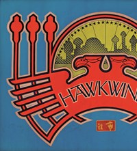
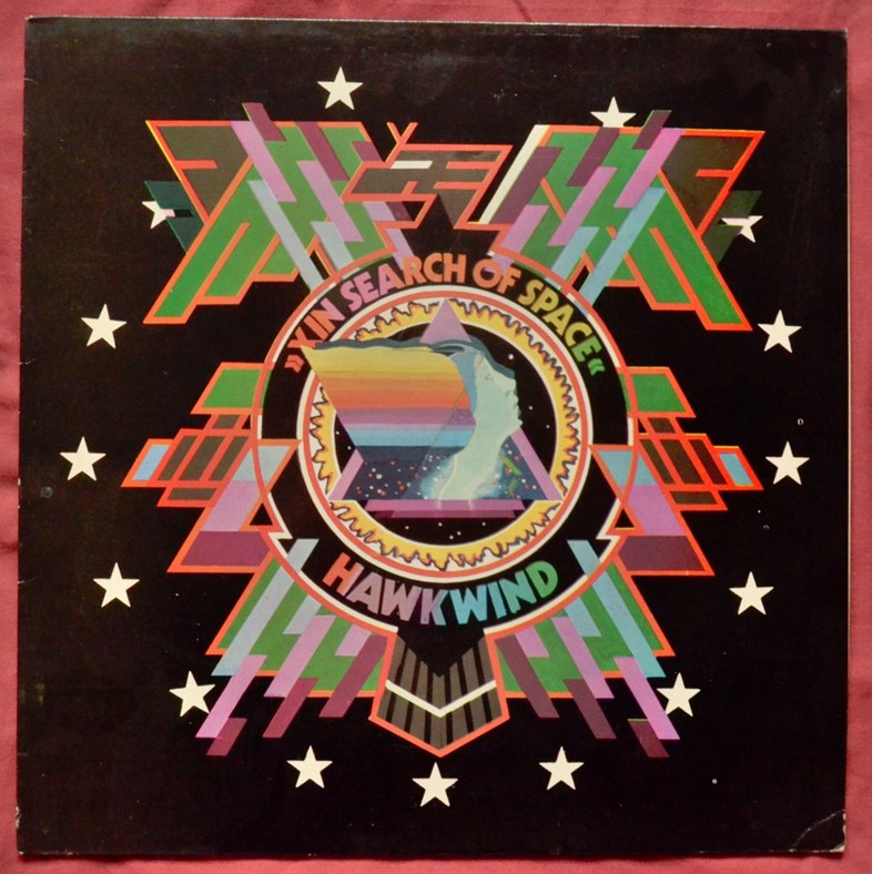
Hawkwind – In Search of Space (1971)
Bubbles began his career at prestigious design company Michael Tucker + Associates, before moving onto The Conran Group, where he conjured everything from logos to Habitat homeware. Soon however, enticed by London’s burgeoning hippie movement, the young creative opted to set up his own graphic art studio, launching Teenberger Designs on Portobello road in 1969. He designed his first record sleeve – for Quintessence’s LP In Blissful Company – the same year, and never looked back, thereafter striking up a fruitful relationship with Notting Hill band Hawkwind, and going on to completely reshape their look, from their album covers to their drum kit logo.
Perhaps his most acclaimed design for the group was the sleeve for their 1971 album In Search of Space. The front bore a psychedelic, heavily graphic emblem that played on the band’s sci-fi image, while the back shunned the tradition of tracklisting, instead presenting listeners with a hazy image of the band playing live, alongside the words, “Technicians of spaceship Earth, this is your captain speaking, your captain is dead.” The cover unfolded into a poster that formed the shape of a hawk, while inside was a booklet, filled with countercultural imagery and text, claiming to be the logbook of the Hawkwind spacecraft crew. Right from the get-go, Bubbles’ provided music fans with an unprecedentedly immersive experience reflective of his boundless imagination.

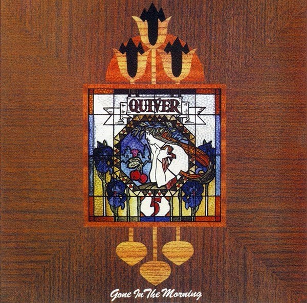
Quiver – Gone in the Morning (1972)
Few covers embody Bubbles’ love of symbolism or Art Nouveau more than that of Gone in the Morning for 70s rock band Quiver. The front is distinctly Fin de Siècle in style: a painted wooden surface is punctuated by a stained glass window showing a flaxen-haired woman, surrounded by fruit and flora. Above the window are three open tulips, while on the back we find three shut versions of the same flower. A bit of lateral thinking gives way to the fact that tulips are light-responsive flowers, which open in the day but close at night – in other words they’re “gone by the morning”. This kind of play on words was the derivation of much pleasure for the famously witty graphic designer.

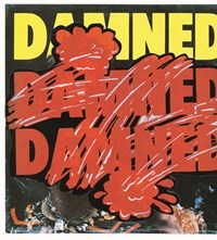
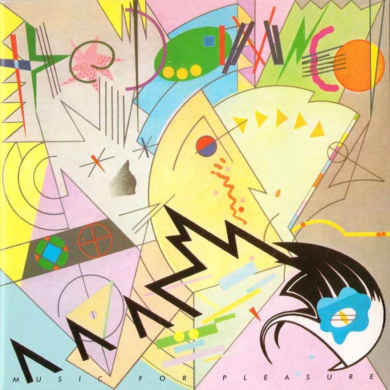
The Damned – Music For Pleasure (1977)
In the 1970s, Bubbles successfully transcended the boundary from hippie rock to punk, joining the newly formed, notoriously subversive Stiff Records in 1977 as designer and art director. While there, he created some of his most reactionary covers, as well as coining the first ever large-scale (60x40 inch) band posters. His style became less decorative and saw him reimagine constructivist and modernist imagery to create imposing collages and vibrant pastiches. His masterful and explosive sleeve for The Damned’s Music For Pleasure, for example, is a parody of the paintings of Wassily Kandinsky and uses wide-spaced lettering to spell out the band’s name (a trait much copied by subsequent album artwork designers).

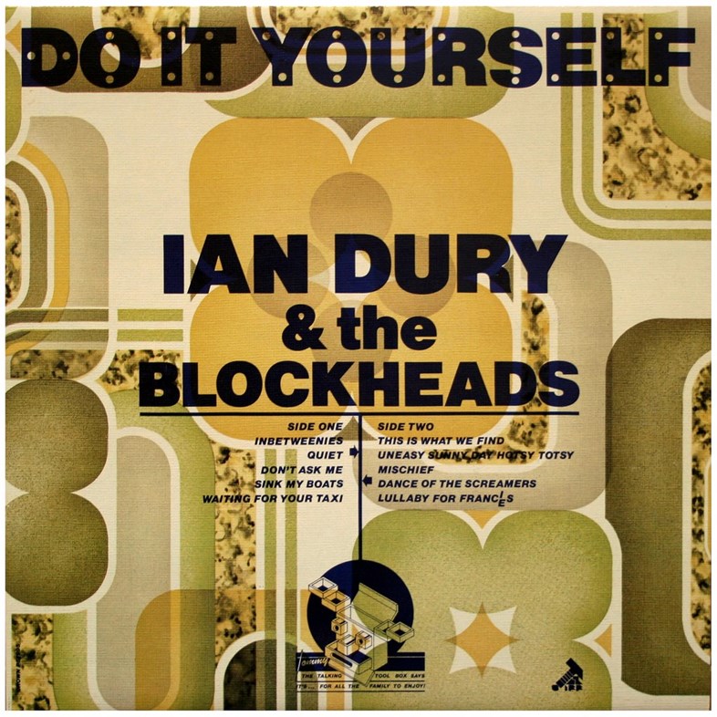
Ian Dury and the Blockheads – Do It Yourself (1979)
Bubbles first designed artwork for post-punk prodigy Ian Dury while at Stiff Records, where he conceived the singer’s iconic Blockhead logo (a monochrome head formed by the word ‘blockhead’). Later both Dury and Bubbles followed Stiff co-founder Jake Riviera as he set up his new label Radar Records, where Bubbles designed the most famous of his LP covers for Dury and the Blockheads: 1979’s Do It Yourself. A shamelessly kitsch affair, the album was released in 28 sleeve variations, which saw Bubbles print the album title, band name and tracklisting in black block capitals on various gaudy wallpaper patterns supplied by Crown Wallpaper.

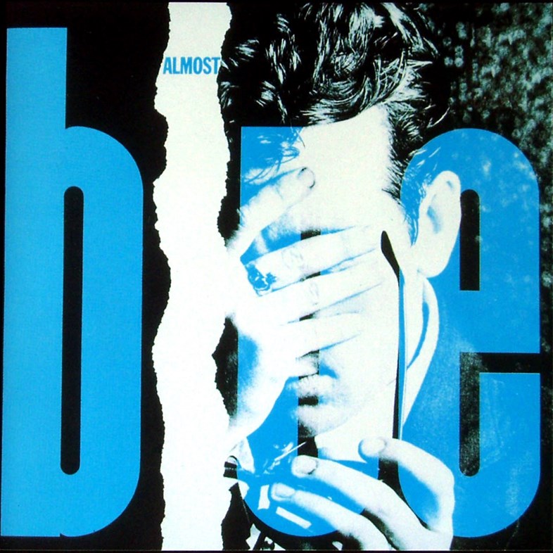
Elvis Costello – Almost Blue (1981)
Bubbles’ artwork for Elvis Costello is some of his most inventive. Early in the musician’s career, Bubbles came up with the idea of placing advertisements in three UK music papers, which, when pieced together, would form a striking poster for Costello’s album My Aim Is True. In 1979 he designed the garish, elephant-filled cover of Armed Forces, and the accompanying poster featuring a full-length image of Costello below the words “PAY ATTENTION!” – another element included in the Perry collection, where the bold lettering appears on the back of a pique shirt.
One of Bubbles’ final works for Costello, and indeed ever, was the cover for 1981’s Almost Blue – depicting Costello, one hand concealing his face, the other holding his signature spectacles. A white rip runs from top to bottom of the sleeve, housing the word “almost” and forming the letter ‘L’ in ‘blue’, the rest of which takes up most of the cover in aquamarine lettering. This may not seem a particularly innovative work within Bubble’s groundbreaking oeuvre, but that is because the format was so widely replicated throughout the 1980s. In his work, Bubbles was able to capture the zeitgeist, while seamlessly drawing from historic references and skillfully preempting future trends. As legendary graphic design Peter Saville once noted, “Barney Bubbles’ work presents the past, the present and the possible”.