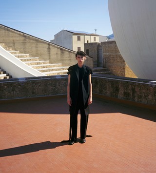
Speaking in his own words, deep-thinking designer Craig Green shares the ideas behind his S/S20 show – the sure highlight of London Fashion Week Men’s
- TextTed Stansfield
Craig Green: “At the beginning we were thinking a lot about skin; skin as a protector, as a layer you could put on top of – I’ve always thought it’s quite a weird thing, that you wear it to protect yourself on a motorcycle, there’s something quite disgusting about it. So, the first section was leather with embedded rib; there was a play on the rib becoming the skin, and the leather becoming the skin, and all those colour-changing ideas.
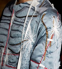
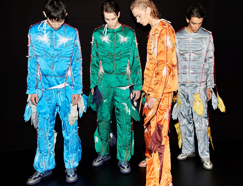
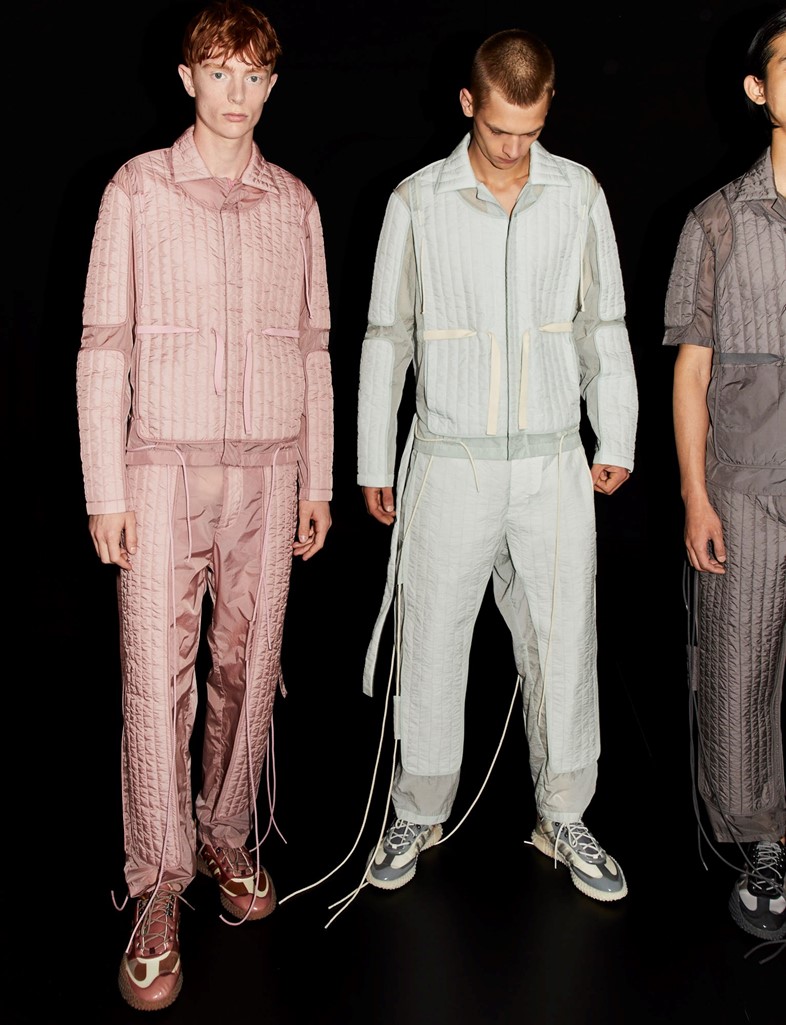
“Then it moved into quilted skin, which was transparent and then padded, bound and quilted – like a wrinkly sports square. Then it moved into the dream suits – we wanted to make something that you would wear to dream in, so they’re all hand-embroidered, padded silk. They’re bodily shapes but inspired by Erastrian anatomical drawings, where the muscles almost look like flowers.
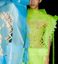
“The last section was the elasticated bodies – the boat sails which were laser-cut into [Mexican] Easter flags. The shapes at the beginning were meant to be there in the end, but by the end they became a really stand-out, like an alien bisexual. The lines on the body as well, I was reading about how they used to measure people’s faces to tell if they were a criminal, or a certain type of person, so I guess it was that, too.

“The patterns and shapes were inspired by Mexican and Eastern designs, I like the idea that they’re something so far away, but they’re also about resurrection – the whole idea is about a mirror. I thought it was interesting because everyone I sent a picture to, asking if they thought it was a good or a bad thing to do, referenced a different country. One of my friends said ‘oh those Turkish mirrors’ and someone else said ‘they’re those Indian mirrors’ – everyone had a different point of view.
“The adidas collaboration is new. The main shoe that we did was the Kamanda – we took the texture of the sole and covered it completely on the top, so it almost gave that ghost idea we’ve played with previously. And I like that it kind of looked like a weird lizard, and I like the adidas logo as well because I think it really looks Egyptian, even though it’s probably not meant to.

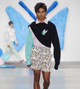
“The padded suit looks became almost some magical god, they were moving so fast it just became many hands and many feet. There was that innocence idea, the gingham, the prints on top of them, they’re from machines that teach you how to fold your shirt – you know that woman, Marie Kondo – it’s a shirt folding device that has the arrows that teaches you how to fold it. I liked that they kind of looked like recycling bags for your body – not to sound so dark – that’s why I liked the symbols, it looks like the animals and the earth are eating your body, like a plastic bag.
“I liked that [the nunchucks] looked a bit like bone, but also like wind chimes or some kind of alien instrument. But they’re made from plumbing pipe. They kind of look like hieroglyphics as well, in an abstract, non hieroglyphic type of way. I wanted to squash them into the body, and to embed the plastic into the skin. They were meant to be drums, I liked the idea of skin being drums and – I guess that’s where the innocence idea comes from as well, a drummer boy in battle. They were glorified, like the mascots of the brigade, and would run the beat for men to fight the march to. They were kind of an untouchable youth.”