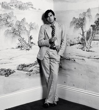
Ahead of a new exhibition charting New Order and Joy Division’s influence on art, graphic design legend Peter Saville discusses creating their seminal sleeves
- TextDaisy Woodward
“There has been very little academic acknowledgement of the significant relationship between the arts in contemporary culture – between music, fashion, fine art, design, architecture and so on,” says legendary graphic designer and art director Peter Saville. “When we read about visual art, the influence of music is usually disregarded in favour of a more canonical rhetoric.” Saville is speaking ahead of a new exhibition, titled True Faith, opening as part of this year’s Manchester International Festival. The show looks to spotlight the wide-reaching influence that two iconic Manchester bands, Joy Division, and its later iteration New Order, have had upon visual art, something that Saville – co-founder of the bands’ record label, Factory Records, and designer of their seminal cover art – feels is long overdue.
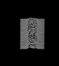
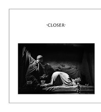
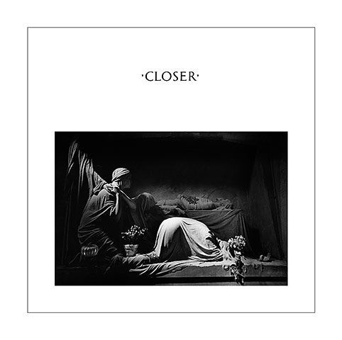
Many of Saville’s sleeves will be on display, alongside works by various contemporary artists including Jeremy Deller, Liam Gillick, Barbara Kruger and Raf Simons. “There’s a feeling about Joy Division’s music that is visually inspiring,” Saville reflects on the famously brooding post-punk sounds of Ian Curtis, Bernard Sumner, Peter Hook and Stephen Morris. “For me their two albums relate to two polar feelings I had of Manchester growing up there. Unknown Pleasures (1979) conjures iodine lights on a wet underpass: the 20th-century city. And Closer (1980) is the gothic revival cathedral; it was the dark satanic mills, the Jerusalem of the Industrial north.”
For the Unknown Pleasures album cover, Saville explains, the famous wave, taken from the Cambridge Encyclopedia of Astronomy, was given to him by the band. “Then I just followed a very simplistic grid of design because I was inexperienced,” he says with a laugh. “I stayed within the parameters of self-confidence and my personal taste.” Closer, however, was his own concept from the start. “When the band came to my London studio, they asked if I had anything to show to them. Under pressure, I got out some pictures I’d seen in a photography magazine. I didn’t know about the moodier direction they were taking and didn’t expect them to respond to the images, but they did, quite intently. They gathered around and chose the photograph of the tomb in Genoa. A month later, Ian died and suddenly the cover took on a new meaning. There was a lot of heartfelt discussion as to whether to go ahead with it, but we decided to honour the collective decision.”
)
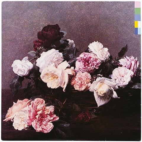
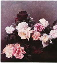
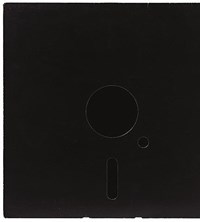
When the band reemerged some months later, with a new name, a new member (Gillian Gilbert) and a brand new sound, Saville was amazed. “I had so much respect for their courage to re-form. They completely reinvented both themselves and the shape of modern music; their conflation of rock and sequenced dance music had never happened before.” Over the course of the next decade, the band went on to break sonic boundaries with each new album. Saville’s sleeve designs were similarly varied – from Blue Monday’s floppy disc to Henri Fantin-Latour’s flowers for Power, Corruption, Lies to the images of the band members themselves for Low Life – inspired by the group’s progressive trajectory. “They were like avatars, not only for other musicians but also for fashion designers, artists, photographers and designers. They carried a torch that lit the way, which, now that I think of it,” he adds with with a chuckle, “is prophesied by the image on their first single cover, Ceremony – the hound of truth, carrying a torch!”
True Faith is at Manchester Art Gallery from June 30, 2017
)